
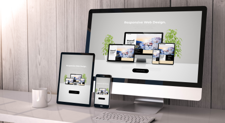
What Does It Mean to Be Responsive?
 Back in the old days between 1990 and 2010, the resolution of computer monitors was mostly 800 x 600 or 1024 x 768. Responsive wasn’t a thing in most web development. That is, until those darn smart phones came along showing web pages in a vertical screen, not a horizontal screen and making viewers scroll sideways and up and down. Both viewers and developers were annoyed.
The world of web development changed. The thing about that lovely watercolor you bought at a gallery is that it’s the same size every time you look at it. not so much with websites. Website have to morph to fit whatever size screen the viewer is using at the moment … and it has to morph for all sizes that might come along in the future.
What if I Have a Responsive Theme?
 My WordPress theme, Kahuna, is responsive, sort of. There are two ways to think about a theme being responsive. 1) It starts with a horizontal, desktop/laptop layout and morphs to a vertical/smaller screen. 2) It starts with all screen sizes in mind, often the reverse of #1. The fact that it’s a “theme” implies that the graphic artists are involved with layout, colors, spacing, etc. The other aspect of each page is the programming to bring the elements into that design are involved after the design is finished.
With a WordPress site, it’s not only the theme that has to be responsive, but plugins that create parts of a page have to be responsive, as well. The first item that needed responsive adjustment on the MontanaWebmaster.com site was the home page slider. The slider is not a part of the theme. Instead, it is created by the MetaSlider plugin. While the slider resized just fine, the caption text started at the bottom of the image and sized upwards, covering the image. So, the CSS (layout) coding for the slider caption had to make the position of the caption start at the bottom of the image and size downwards.
The Problems are Mostly in the Spacing
 Mobile versions of your website need to have the same care for spacing as the default version. On my site, the business name is crowded up to the left side in the smallest mobile version.
In the WordPress Kahuna theme customizer, you can control the words and color of your title and subtitle, but you cannot control the positioning. So, the changes have to be made in the CSS code. Now that I know what the outcome should be, I need to find what code to change. To do that, I will use the Developer Tools in Chrome.

Note that the tool shows that the title block is called site-text. The column on the far right shows the CSS code that provides formatting rules for the layer. Notice that it has float: left; , but there is no padding or margin to give it a little space. So, I will go to the file structure and add a rule for spacing.
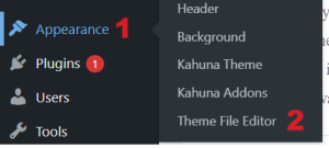 There are two ways that I can access the files. The first is through FTP software that allows me to download a copy of the file into my computer and then re-upload it with changes. The second is through the WordPress File Editor tool. The benefit of using FTP is that when I work on the files on my computer, it keeps my local copy up to date. But, using FTP also means that you could wipe out your whole site with a couple of clicks.
The file I will change is the style.css file, which controls the formatting of the site. The Developer Tools, as shown above, has already told me what layer (part of the code) to adjust. So, I add a rule to the site-text layer for the smallest mobile version to give it some padding on the left.

Here is the code I added to the style.css file:
#site-text
{
padding-left: 10px;
} /* 7/15/24 Nora added to move the title away from the left margin */
Notice that there is a comment inside /* */. That reminds me of when and why that code is there. This code will not affect how the page looks.
Refining the Use of Banner Space
A website banner is very important, but only when the viewer needs it. Subliminally, they need it to identify that they are at the correct site. They may need it for navigation. But, mostly making good use of the white space means that viewers don’t have to scroll as much to get to the content area.
In the last step, I added white space between the left side and the text, but now I need to tighten the text and the hamburger menu. There is excess space above and below the banner text.
Resources
https://www.nngroup.com/articles/computer-screens-getting-bigger/